
How to Do a Data Science Project That Is Actually Useful
Originally published on Medium for Analytics Vidhya in 2019.

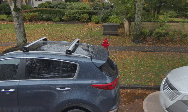
Do you know where the richest fire hydrant in Vancouver is?
The richest fire hydrant sits at 2115 W 40th Ave. From 2011 to 2018, it raked in $85,000 in parking tickets. As you can see from the google street view image below, the hydrant is very popular.
I recently spent 2 months exploring and applying data science concepts in an intensive Machine Learning Bootcamp at 7 Gate Academy. For the bootcamp’s final project, my partner Kohei and I created Ticket-Dodger.com, a solution to help you avoid parking tickets in Vancouver. Follow along on our journey!
Disclaimer: This project does not encourage you to park against the law. It was created to help the city and it’s residents understand how tickets are being issued. The best way to avoid tickets is to pay for parking!
What you can expect from this article
This article will provide you with an overview of our trials, failures, and successes on the journey to create Ticket-Dodger.
Overview
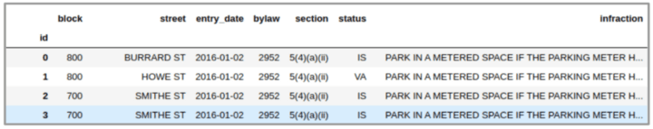
We want to determine the likelihood of getting a ticket when parking in Vancouver. The City of Vancouver has an open data portal containing many interesting datasets about the city.
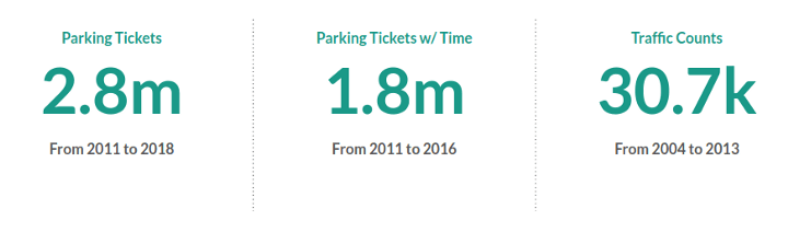
We were lucky to find a dataset of all tickets issued from 2010 to 2018. Each ticket had the block & street where the vehicle was parked, the date of issue, and detailed infraction notes (bylaw, section, status).
It seemed like we were set. 8 years of tickets in a city as busy as Vancouver is a lot of data! Just throw it into a machine learning algorithm and boom: we’re data heroes!
Getting familiar with the data and our goals

Closer inspection of the dataset made us realize that it was going to take a bit more work to deliver a meaningful product. We recognized 4 problems that we had to solve:
Problem 1: We don’t have any way to relate streets to each other.
We can see how many parking tickets a street has, but the full story requires more context. It would be helpful to have a metric that every street shares to normalize our comparisons.
Problem 2: We want the likelihood of a ticket for a certain time of day.
We just don’t have the data. This is a problem because domain knowledge tells us that driving and parking patterns will change throughout the day. For example, traffic to work and from work during a workday.
Problem 3: How can this be a useful tool for the residents of Vancouver?
We want to have a truly useful end product in mind to guide our data science journey.
Problem 4: Remote workflow and communication
Working from different locations, it’s important to define our team availability and to ensure productive communication.
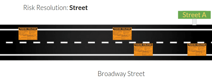
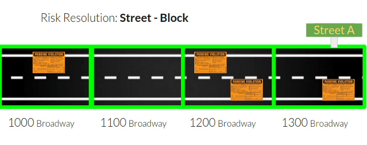
Problem 1 — Comparing Streets
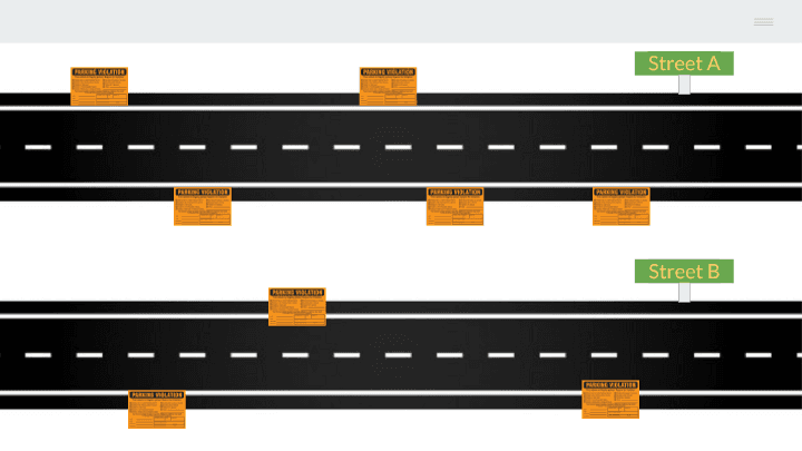
If you take a look at the streets above, you can see that street A has 5 tickets and street B has 3 tickets. On first glance, you might assume that street A has a higher risk than street B.
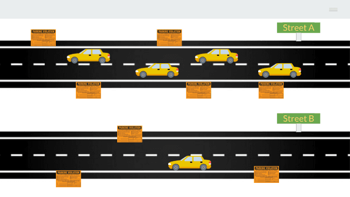
Is your answer the same after seeing traffic volume overlaid on the image? The amount of tickets hasn’t changed, but we can see that street A is used a lot more than street B.
Finding the right metric
The problem with defining risk becomes a little bit muddier. We can see that the number of absolute tickets might not translate to the absolute risk for a driver.
How can we account for this?
-
Should we figure out how many parking spots are on the street?
-
Should we hit the streets with clipboards and count the amount of drivers that don’t pay?
-
Should we use a road utilization metric?
-
What is road utilization?
There are many ways to attack this problem. Ideally, Vancouver would provide a dataset that tells you how often a parking stall is used. Seattle does this, and I’m pretty sure PayByPhone would have this info as well.
But then we still wouldn’t know exactly how many people are not paying for parking, because there would be no record of them.
We have a lot of fish, but no river.
Ultimately, determining the exact likelihood of getting a ticket on a street would prove to be a very difficult task.
Instead, we used traffic counts to define road utilization. This is great because we can now determine risk relative to the amount of traffic that comes through the street.
With that metric, we can compare the risk from one street to another.
Getting traffic counts
We found a database to get traffic counts! Well… almost.
VanMap overlays information about the city on an interactive map. When you click a street, you are able to see all of the times that a street has had traffic count measurements taken.
These counts range from 2004 to 2013. The measurements are recorded hourly and daily.
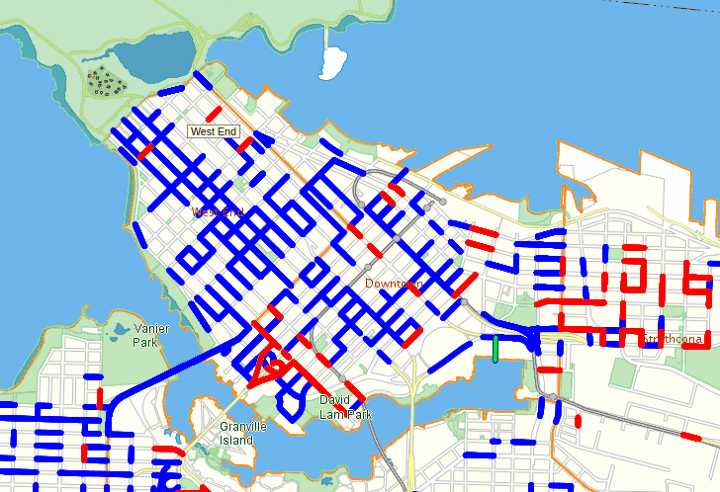
As you can see above, there are also a few streets missing. There is no other public API that easily provides this information. This is all we had to go on, but we were happy we had it.
The fact that this data didn’t exist as an easy to download dataset didn’t stop us. All we had to do is copy the request sent to their server and Python happily retrieved the information for us. Good job Python.
Problem 2 — Never enough time
Our original dataset provides us with the date that the ticket was issued. This is useful because we can test how things like holidays and days of the week affect our parking ticket risk.
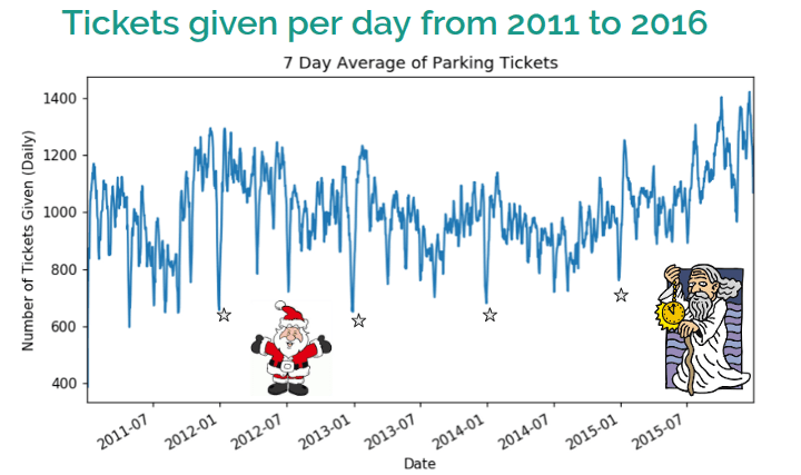
Looking at holidays

Christmas Day and New Years Eve have never had a traffic enforcer out. Rest assured you can park freely.
We came across this by accident while specifically looking up Christmas Day to see how many parking tickets were issued. Because there were no tickets issued, there was no data or rows for those dates.
Lesson learned: When dealing with time series data, create a new index with every date so that you can find these gaps.
For fun, lets look at some more holidays. The chart below is a sample of our data for the year of 2013. We can see that for the most part holidays tend to have a lower amount of parking tickets issued.
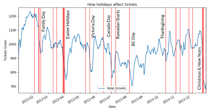
But, for some reason Ramadan saw an uptick. We’ll chalk that up to one of those correlation does not imply causation things.
Getting what we want
Having the date for each parking ticket is all fine and good. But Ticket enforcers need to eat, sleep, and shower. They have scheduled shifts.
We are missing this information.
Undeterred, we submitted a freedom of information request to get the time of tickets issued. That is currently ongoing. But as luck would have it, while trawling old FOI requests, we found a similar request made in September of 2016. This trimmed the latest 2 years off of our dataset, but going forward we will be following up on the current FOI request.
For now, we’re in!
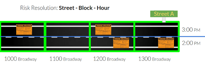
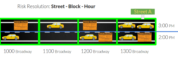
Time is definitely a factor
It felt like the flood gates opened with this data. Our resolution just increased from days to minutes!
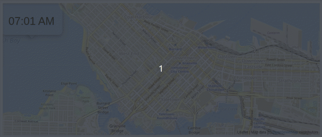
The above animation shows parking tickets being issued over time in Vancouver on a day in 2016. Each time there is a parking ticket given, the blue line gets darker.
There’s lot of enforcement in Yaletown early in the morning. The West End doesn’t really have much activity until the afternoon.
You can also check out an updated animation using Uber’s Kepler.gl for the month of January 2015 here. The playback controls are on the bottom left of the page. If you slow the speed down to 0.1x you can see how the parking tickets are “breathing” in Vancouver. You can also see the direction enforcers are going, especially on Broadway.
We also aggregated the number of tickets issued to see what an average day looks like. Ticket enforcement picks up around 9 am, peaking at 3pm with a lull at 5:30pm. Then, there is another uptick at 8pm.

Lets review what we have

The dataset with time had fewer entries than our original dataset with just dates. Time was much more valuable to us, that is why we are okay with having less data to work with.
Up until now, this post has been about our exploratory phase. We first established what we knew about the domain:
- Different streets have different characteristics, making 1–1 comparisons difficult.
- Risk varies by weekdays and official holidays.
- Risk varies by time of day.
Afterwards, we spent a significant amount of time finding data from a bunch of different sources to start solving these problems. It’s important to have a definitive start to product development. Intimidating obstacles and new information will always appear.
Once we felt comfortable with our ability to start answering the questions, we moved on.
Problem 3 — Producing a useful tool
Machine Learning

Now that we have data, we have to do something useful with it. This was our approach for:
Cleaning the data
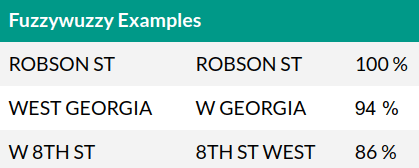
We have three different datasets that we need to combine. The biggest hurdle was making sure that street names and blocks on each dataset followed the same format. Unfortunately, each dataset had its own way method of street spelling. Sometimes the same dataset had different ways of spelling the same street.
For example: W 8TH ST, WEST 8TH ST, 8TH ST WEST are all the same street!
Vancouver’s open data portal came to the rescue again. There is a dataset that has a master list of all street names. We used this master list to be our ground truth for streets. Matching similar street names is easy for humans. For a computer, it’s not that easy. However, some very clever people have come up with a great solution to that problem. We found a really cool python library called fuzzywuzzy.
Fuzzywuzzy compares two strings (words) and scores their similarity. It did very well and matched 80% of the streets in one shot.
200~ or so major streets were left for me to manually fix. This is boring, so I created a fun tool that turned this into a “game.”

The second biggest hurdle was getting our traffic counts dataset into a useful format. This was almost as fun as the game I made.
- There were missing traffic count measurements between street blocks, so we had to fill in those blocks.
- Some streets also had limited entries, or old entries from 2004. In those cases we had to extrapolate what we believed a reasonable increase in traffic would look like.
After cleaning, we can use the block and street as a key to join the different datasets together.
Creating a target variable
A target variable is what you are trying to predict. In our case, we want to predict the risk of getting a parking ticket.
Do you remember early in the article when we talked about Street A and Street B? Our takeaway from that example was that the absolute amount of tickets issued doesn’t necessarily translate to a higher risk.
That’s why we are using traffic counts as a denominator. We want to capture this intuition. This also gives us a good way to compare busy and quiet streets’ ticket risk.
Our Process:
- We divide an amount of parking tickets given in a certain period by the amount of traffic that the street sees during that same period.
- We threshold this output into LOW, MEDIUM, HIGH and approach the problem as a classification problem.
We do not have enough data to produce the absolute likelihood of getting a ticket, but we do have enough data to help a user decide if the risk is worth it or not.
Iteratively building a target variable
To attain small wins, we built our target variable iteratively. We started looking at the risk of getting a ticket for an entire street, and increased the resolution as we continued the project.
User Experience
Before we start training, let’s bring the user back into focus. It is much more important for us to have accurate LOW risks. For example, if you park expecting a low risk and you end up getting a ticket, it will be much worse than if you went in expecting a ticket and got none!
Tracking our models
We created a Model Zoo in Google Spreadsheets. This is where we keep track of our models’ performance. We kept track of things like which model we trained, the framework, inputs, dates of creation, parameters etc.
Tracking our models was crucial because of the dynamic nature of our target variable. I’m sure there are better solutions out there, but for a team of two, this was adequate.
How we trained our models
The inputs for our model ended up being the block, street, hour, day, and month of the parking ticket. Then, we started machine learning like this:
The following models were trained:
- Logistic Regression, KNN —scikit-learn
- Neural Networks —keras
- XGBoost — XGBoost
Our winners were Neural Networks and XGBoost.
We plotted the learning curves, and it doesn’t appear that there are problems overfitting or underfitting the data. Therefore, we could compare their performance properly. Check out this article to learn more about interpreting learning curves.
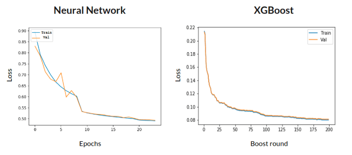
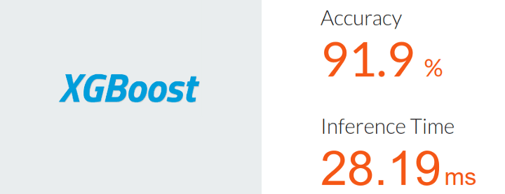
We then tuned their hyperparameters with the libraries Hyperas for our neural network model and Optuna for our XGBoost model. XGBoost ultimately won with an accuracy of 91.9% and an amazing inference time of 28ms.
Evaluating our model
Subjectively evaluating this model is difficult. The best that we can say is that we do a pretty good job of determining the low risk of getting a ticket. We cannot guarantee zero tickets.
However, we did chase down a parking ticket enforcer and asked for his opinion. He looked at us suspiciously before telling us that W 8TH AVE at the 500 block is one of the riskiest streets for getting a ticket.
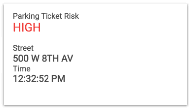
Good job model. Well done.
Web Application

Okay, now we have a working model. We can predict the risk of getting a ticket. Great! All we have to do is ask our users to get their jupyter notebooks out and start speaking in json and gps coordinates. #human
OR — we build a web app!
Check it out while you read along: Ticket-Dodger.com
MVP Criteria
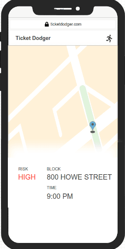
For our MVP, we wanted to create a minimal web app that works on mobile and desktop. Ideally, when you open the app, it will get out of the way and just tell you your risk. After grabbing your current location, and time, it would highlight the street and it’s current risk level on a map.
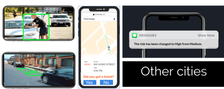
Stretch: If the risk on a street is high, let the app show users the nearest street with a low risk.
The approach
First and foremost, build the damn thing using tools that you‘re already comfortable with! You don’t need to go learn the latest cool guy 2019 front end javascript framework to make this. Sometimes vanilla JS and HTML is enough.
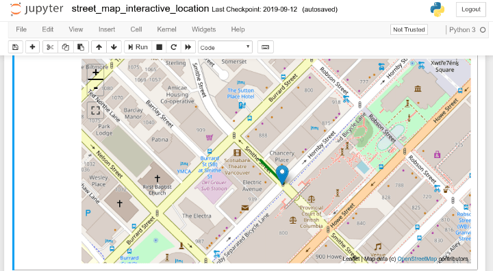
For most data science folk, we’re pretty comfortable in Python and Jupyter Notebooks. So, we prototyped all of the functions and the map in a Jupyter Notebook using IPYwidgets.
With IPYwidgets you can mock a GUI to grab input right inside the notebook. The map library we used is leaflet.js, and there is an IPYwidget for it as well.
We didn’t want to rely on external API calls for something small like matching GPS coordinates to a block and street, so we just built a matching engine in house.
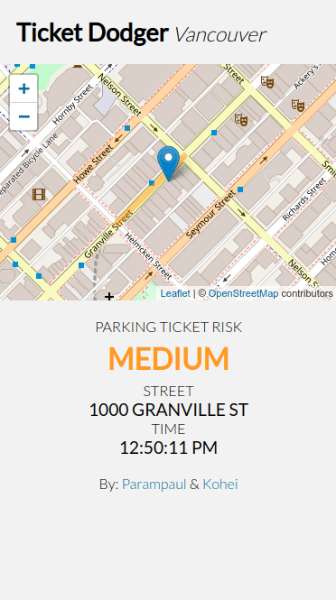
After we were happy with the functionality, we translated the prototype into production code. We used Flask for the backend behind Gunicorn, and NGinx on a Digital Ocean droplet. All we’re doing is getting GPS coordinates and the time, running it through a model, and returning the result.
Keep it simple.
On the client side, we use Javascript and HTML, deployed on Github Pages.
PS: VSCode has a super useful extension calledLive Serverwhich updates your site in a browser as you edit.
The future is bright!
When approached with machine learning, it’s hard not to get carried away. We are very happy with our MVP, but are also excited about the many different technologies that could be fun to implement into Ticket-Dodger.
Problem 4 — Working Together Remotely

This problem turned out to not be such a big problem, but still had to be planned for. I live in Abbotsford, and Kohei lives in Vancouver. Outside of course time, we would be working remotely so it was important to establish a system. Without establishing our system, I feel like most of our communication would have been: “whats the best model we have so far? where is it? in that email you sent? or slack? or messenger?”
Project Management
We worked in the Agile way, using Trello to manage our product backlog and sprints. We made sure to review each others work to the standards that we set out for ourselves before marking anything as done.
Oh, and of course, Github for code revisioning.
Data Warehouse
We needed a flexible data warehouse because of the different types of files and data we were storing. For example, our personal and shared notebooks, development and production models, ground truth raw data, and sanitized data, etc.
We used Digital Ocean Spaces because Digital Ocean is what we were most familiar with at the time. Digital Ocean Spaces has the same API as Amazon S3 so we could use boto3. We built a really simple UX layer on top of boto3 so that we could programmatically be up to date with each other’s work, and filter for latest changes.
Daily Meetings
We established daily meetings every morning. When we did have class, we came in early to work together. If we did not have class, we would schedule ad-hoc in person meetups.
We had tools and processes to seamlessly manage our project and our data. Because of this, our communication had a lot of bandwidth for big picture problem solving.
Conclusion

In an article about data science and machine learning, only about 12% of this writing was about training machine learning models. The majority of the time spent on this project was not solving technical problems. The majority of the time was spent on understanding the domain, creating questions, and finding/cleaning the data required to answer those questions.
We knew from the beginning that we wanted to have a web app as the end product. Having a rough idea of what the end result should look like guided us and helped us stay away from rabbit holes.
Building everything iteratively allowed us to celebrate small wins throughout the project. More importantly, every time we moved forward, we learned something new. Being agile allowed us to try things quick and adapt accordingly if new information says we should be doing things differently.
Acknowledgements
-
I want to say a huge thank you to 7 Gate Ventures for creating their Machine Learning Bootcamp curriculum & to all of our instructors.
-
And a huge thank you to my partner Kohei Suzuki! (linkedin) We had a lot of fun working together on this project. I learned a lot from you and I’m excited to see what we can do together in the future.